It’s well known that I’m a font nerd. before the DTP revolution started and everyone discovered that there were such things as different kind of typefaces let alone the difference between the eleven different flavours of Garamond and Times New Roman, my favourite book was the 1975 Letraset catalogue.
The typewriter font that Arcy is thinking in in this strip is different to the one in the previous two strips. That’s because this time round I had the chance to typeset this at work in a typewriter font I was happy with (Prestige 12 pitch), print it out and paste it down onto the artwork before scanning, whereas the previous strips were done with the font I had available at home, Prestige Elite Standard, which is essentially the same font but doesn’t look quite so analogue, and also typed directly into the Photoshop document, making it look too clean.
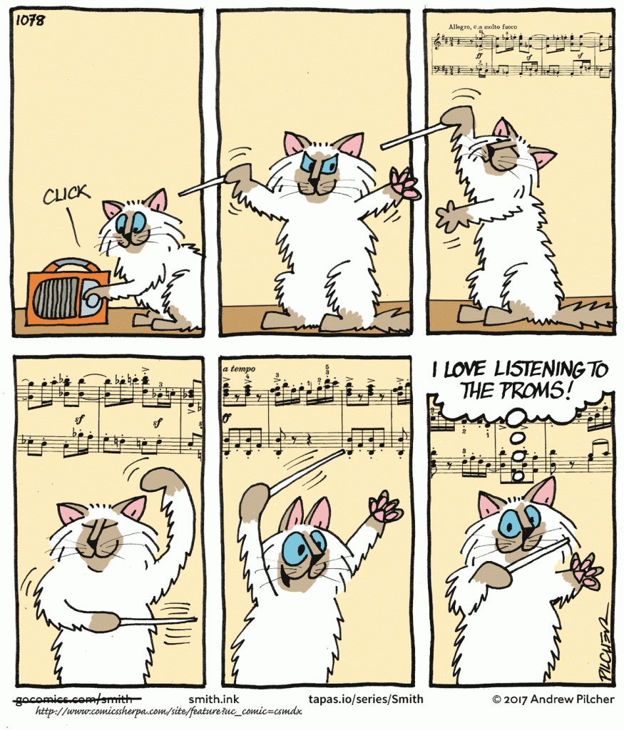
I’ve also always been fascinated by the font that is used in old musical scores from the days before computer typesetting. For some reason all the notes composers made on their score had to be in a particular dense and well-worn italic face, the name of which I don’t know. I simulated my own version of it by typesetting the final balloon in Janson Italic, and then drawing over the top of it with a thin marker pen.